First impressions are key to drawing potential clients in to engage with your business. In the way that a firm handshake and good posture are key to a good introduction, your website should use design and imagery to present the best digital impression of your business.
For most advice practices, websites aren’t there to attract cold leads, they are there to build trust and foster engagement with referrals (typically via word of mouth, but also from social media and elsewhere). This translates to two key factors:
- Credibility, and
- Referability.
We’ll be breaking this topic down into:
- The statistics
- Internally sourced images;
- Externally sources images (typically stock photos); and
- Image management
The statistics
The importance of web design on credibility metrics has been extensively studied, with results showing a strong bias towards the visual appeal. The stats below indicate some key findings across several studies.
- First impressions are 94% design related and 46% of consumers based site credibility on visual appeal and aesthetics (Silence, Briggs, Fishwick and Harris, 2004).
- 75% of consumers admit to making judgements on a company’s credibility based on the company’s website design (Stanford, 2002).
On referability, this statistic is huge:
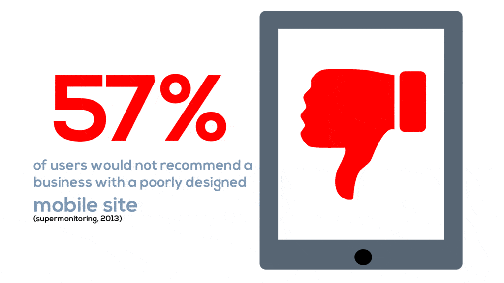 Note: This is a 2013 study, so we argue this figure is well over 80% now.
Ok, so design goes to credibility and referability. So what? Well, that becomes outright scary when we consider how little time we have to significantly influence these key metrics. Noting that:
- You have 0.005 (1/200th of a second!) to inform the first impression, which directs whether a visitor will stay or go. (Lindgard, Fernandes, Dudek and Brown, 2011).
- You then have 2.6 seconds before eyes land on the area that most influences their first impression, representing the conscious impact. (Dahal, 2011).
- Users spend 5.94 seconds looking at the main image. (Dahal, 2011).
- Users spend 5.59 seconds looking at the written content. (Yes, that’s less!). (Dahal, 2011).
Put these together and the logic is as follows:
- We only have a matter of a few seconds to inform first impressions,
- The main image of the site actually receives more attention than the written content.
As a result, getting the imagery correct on your site is very, very important. But never fear; we’re bringing imagery into focus in this very blog.
Tip: Bookmark this page if this article is something you want to be referring to later when it comes to reviewing your website imagery.
Internally sourced images
There are certain cases where you must take an image yourself (or directly through a professional photographer) for it to be relevant. Key examples would be headshots, team photos, or an image of your office.
We can’t stress the importance of having high-quality images (and ideally video) of key team members enough. In financial advice, engagement is very rarely with the brand, and almost exclusively to the individuals who represent that brand.
To effectively present your key team members, be sure to:
- Get a professional to take images of your office, from an angle a client would approach it.
- Have consistent photos of your staff taken with the same backdrop/environment and in the same style, ideally in the room where you’ll be meeting clients.
- Dress as you would for a client meeting. If you’re usually in a branded polo, don’t have a three-piece suit in your photo.
- If your premises aren’t so nice, you might make it less prominent, but it’s still worth being on there somewhere. If that’s really going to put someone off, it’s best that happens before they waste your time.
- Whilst team photos are great, it can be helpful to keep a backup alternative that only includes key staff (principals or advisers) that change less frequently.
Throughout your site, the more the imagery informs the real-life experience, the easier trust will come in that essential first meeting.
Get this right, and when someone arrives at your location you’ll have already made good on the first promise: Being true to label.

All things being equal, people do business with, and refer business to people they know, like and trust. – Bob Burg
Fun fact: Presenting images of your team and office helps build a form of ‘mere exposure effect’, where repeated exposure can enhance a person’s attitude towards a stimulus (Bornstein and D’Agostino, 1992).
So, in the same way that you might like a song more after hearing it on the radio a few times, clients would feel more comfortable and positive about your team and your firm after repeated exposure. Your website is the first opportunity to build exposure, so it ought to be as aligned with your team and your office as possible.
Stock photos
The internet is a vast plethora of content and images, but the last thing you want is to get into copyright strife by taking images as you please. Copyright laws vary with the requirements you need to fulfil for use, but usually, it’s something like the below:
- Purchase a license to use the image – These can vary from single-use to unlimited use.
- Attribution of the author – You can use this image if you credit the author and link the source.
- Freely useable – The simplest images to use, you can be nice and credit the author, but you won’t be breaking any laws if you don’t.
Always carefully check the copyright details for images or the websites where you’ve found them. This way you can have peace of mind about the images used on your website. Also, keep a record of the source in case something changes.

Stock photos are a great resource for fleshing out your website because after all, we can’t have every picture being of you.
Paid stock photos can be great for key real estate on your website. These images tend to have a greater impact on the impression of your website since they will likely be the first thing visitors will notice.
Here are some premium stock photo libraries worth checking out:
- Getty Images – Extremely high-quality images, but at a premium. Content on Getty is also exclusive, meaning it can’t be sold on other stock photo websites.
- iStockphoto – Owned by Getty Images, but the content is non-exclusive. Resulting in cheaper license prices with similar content quality.
- Shutterstock – Probably the most competitively priced stock photo website, which provides decent image quality.
- Adobe Stock – A relative newcomer having launched in 2015. This conveniently sits in the Adobe Creative Cloud, so it’s worth looking at if you’re using the broader Adobe suite.
For less important images (eg: blog posts) or when you’re on a tight budget, there are other options. These days, there are plenty of free stock photo libraries that only ask for accreditation of the photographer in exchange for the use of snazzy images. Two leading ones are:
- Pexels – Has great range.
- Unsplash – A little bit artsier, but has some great people shots that don’t look staged.
Note that Canva is also a great platform if you’re already using this for design work. It offers an impressive variety of imagery, particularly if you have a paid account (which is offered for a reasonable price).
There are a few things that can aid in choosing stock photos for your website too:
- Ensure the focal point of images are centred, in most cases this will keep the image looking good when the page is viewed on different devices.
- For key home page images, try and go for colours that work well with your own branding for a cohesive professional feel.
- Try to choose candid looking images. Natural images reflect the genuine nature of your business, whereas images that are too staged create an impression of being fake.
- For blog posts or subpages, choose an image that’s relevant to the point you’re trying to make. Use keywords when searching stock photo libraries to find appropriate images.
Protip: An awesome alternative to stock photography is getting an illustrator for your site. As an example, Patrick Flynn used illustrations for his blog here when he wanted to clearly support the message.
Finding an illustrator on UpWork or similar can be worth the effort depending on your style, the volume, and the type of content you write. Our favourite example comes from Susie Munro of Sixpence Media (who is a superb copywriter) who uses very clever illustrations throughout the site that supports the overall message.
Image management
Whilst the image itself is the most important part, there are a number of things we can do to optimise the image when hosted on a website. This can impact load times, compatibility across devices and browsers, as well as SEO.
Sizing
Sure, higher resolution is better, but excessively high file sizes can easily slow down your website and ruin the user experience. The best practice is to source high-resolution images for uploading, but use some basic image editing software to crop the image to suit the context of use and reduce file size (even Microsoft paint can do the job fine!). A good rule of thumb is to have roughly 1000×800 pixel images for blog posts and subpages. Ideally, images shouldn’t be more than 200KB.
File types/compression
Compressing your images is worth the extra effort. It can have a very significant impact on your page load time. This can be influenced when saving the image (depending on the software, you may get a prompt on how much to compress the image) and by the file type used.
Definition: Lossless compression is compression where none of the original image quality is lost. This should be a minimal starting point for all images.
There are lots of different file types, so let’s discuss which is best:
- .bmp (Bitmap) is the default for MS Paint. Whilst we love Paint in a way that only a child raised on Windows 95 can truly understand, this format is a terrible data-intensive choice. Luckily Paint provides lots of options.
- .jpeg (Joint Photographic Experts Group) is the standard go-to for most software and is a reasonably good choice.
- .png (Portable Network Graphics) is an excellent choice, compressed well and most widely supported. A good default especially where the image has transparency.
- .gif (Graphic Interchange Format) is what we use for moving images.
- .webp is a newcomer who (like JPEG XR and other false starters before it) is much more effective at compression than its decades-old counterparts. Developed by Google, it can in turn be assured long term support on Chrome. Whilst it’s supported by most browsers, the one notable exception is Safari, so you’ll need some fallback code to jpeg2000 (Apple’s favourite) or .png.
- .etf and .ai (ENIGMA Transportable File and Adobe Illustrator respectively) files are not files you can upload to your site directly. They are however high-quality files that you will often receive from your graphic designer. Providing these to your web design professionals gives them the maximum flexibility in getting the best outcomes on your site.
Search engine optimisation
When uploading an image to your site, you’ll have a number of fields you may define that relate to the image. In this article, we’ll cover the approach when using WordPress (the world’s most popular content management system) that we use for our Simply Advice Websites service. That said, similar terms will apply to other services as well.
- Title – Rarely visible (depending on your site settings), this should be a short description.
- Alternative title – This is the most critical field. This is read not only by your search engine but also as users hover over your image and in text-to-audio translations of articles used by those with visual impairments. It should be used in all imagery that is not purely decorative.
- Caption – Like the ordinary meaning, this appears below an image. If you’re going to say something specific and narrow about an image, use a caption. That way, regardless of the device viewing the image, it’ll be right there underneath. Being visible text, this too is read by search engines.
- Description – Rarely visible (depending on your site settings), this is a good place to store information about your image. This could include details on who is captured or its source. We use this to store the original source for stock photos.
So, what to do with this abundance of information? Here are some quick and easy steps:
- If you don’t have good photos of your team and office, we highly recommend you get some now. No matter what you intend to do with your site in the near term, this will help. This is the biggest difference you can make to your credibility and referability.
- Review your stock photography. Does it help support your message, or does it look staged or fake? If it’s not enhancing your credibility, replace it.
- If you have access to your website imagery, run the Google PageSpeed Insights test. If it says ‘Properly size images’ or ‘Serve images in next-gen formats’, then there are benefits to be gained by optimising the sizing, file formats, and compression.
Get the images right, and you’re well underway to helping clients know, like, and trust you and your team.
Whilst images are an important part of the picture, your overall design is also key. If your website might not be up to scratch, especially for a modern mobile experience, please get in touch. We do great websites exclusively for financial advisers, at a fixed price that won’t break the bank.
We also include a whole library of stock photos handpicked for advice, pre-compressed, and ready to go!