Bolton Financial Services

Adam came to us with a clear story and great client energy. He sought a modern, inviting site that reflects his quality and explains his "why" without the hard sell. We delivered.

Bolton Financial Services multiple screen display

Project goals

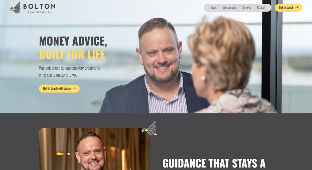
Bolton Financial Service’s Founder and Director, Adam Bolton, sought our expertise to build a client-focused website. After putting off the project for a couple of years, he was finally ready to dive in. We needed to:

uabb-device-phone
uabb-device-desktop

Our approach

  • Express Adam’s voice in a way that makes visitors feel comfortable starting a chat, not entering a sales funnel.
  • Surface the Black Cockatoo narrative that has long informed his logo and approach, but was missing online.
  • Keep the site simple and fast, while still showing breadth of capability and clear pathways to act.
  • Write the words from scratch to ensure a single, consistent voice across every page.
  • Build a dedicated landing page for accounting referrals to support partner handovers.

uabb-device-tablet

Copy-first process

The homepage locks in a straightforward promise that mirrors how Adam speaks: “Money advice, built for life” with a sub‑line that sets the tone for the whole site. The expert intro that follows reinforces the guide role with “Guidance that stays a step ahead” and a human introduction from Adam, plus the site‑wide.

On the About page, we brought the brand story to life. The Black Cockatoo appears as the symbol of foresight and calm course‑setting, told in Adam’s voice and anchored by a short, memorable explainer that visitors actually read.

We shaped a Who we help section around three real‑world cohorts Adam serves most often (growing a business, building family wealth, and planning an early retirement), each with one‑line outcomes and practical bullets. It lets visitors self‑identify quickly, then move forward without jargon.

To demonstrate breadth without turning the site into a brochure, the Services page uses a dual‑accordion structure. Strategic guidance sets direction in plain English, then Practical tools show how the plan turns into action. This keeps the page scannable, mobile‑friendly, and true to Adam’s “less fuss, more clarity” style.

Story, not slogans

Messaing leads with client-focused outcomes using a warm, professional, and human tone.

The Black Cockatoo, finally told

A short, elegant story that connects the logo to how Adam works in practice.

Segmented paths

Three cohort panels with clear benefits and soft CTAs, so the right people feel right at home.

Service depth, simply shown

A strategic‑plus‑practical accordion that reads fast and educates as you go.

Consistent calls to action

A single, friendly CTA used site‑wide to reduce friction.

Referral partner page

We built a dedicated landing page for accounting referrals and wired the intake so, with permission, a short summary can be shared back to the referrer. It preserves borrowed trust, reduces back‑and‑forth, and keeps everyone aligned from first contact. This has been repeated per partner.

The result

A concise, plain‑speaking site that feels like Adam: approachable, thoughtful, and focused on what matters. Visitors see the path, understand the offer within seconds, and have an easy way to start a conversation.

Visit website

Ready to stand out online?

1

Strategise

We define your website’s structure and messaging together, ensuring a clear vision for the build.

2

Create

From crafting content to reviewing designs, we guide you every step of the way.

3

Launch

We bring your dream site to life, providing 1:1 training so you can manage your site from day one.

Book your free strategy chat